CREATIVE DIRECTOR: Zhang Yan
DESIGN DIRECTOR: Yang Yan
DESIGNER: Yang Yan / Qiao Zuo
LETTERING: Fan Junyuan
ILLUSTRATOR
: Zhang Yan / Chen Houzhi
CLIENT:
Pineal Store
“瑰市”开业活动形象系统
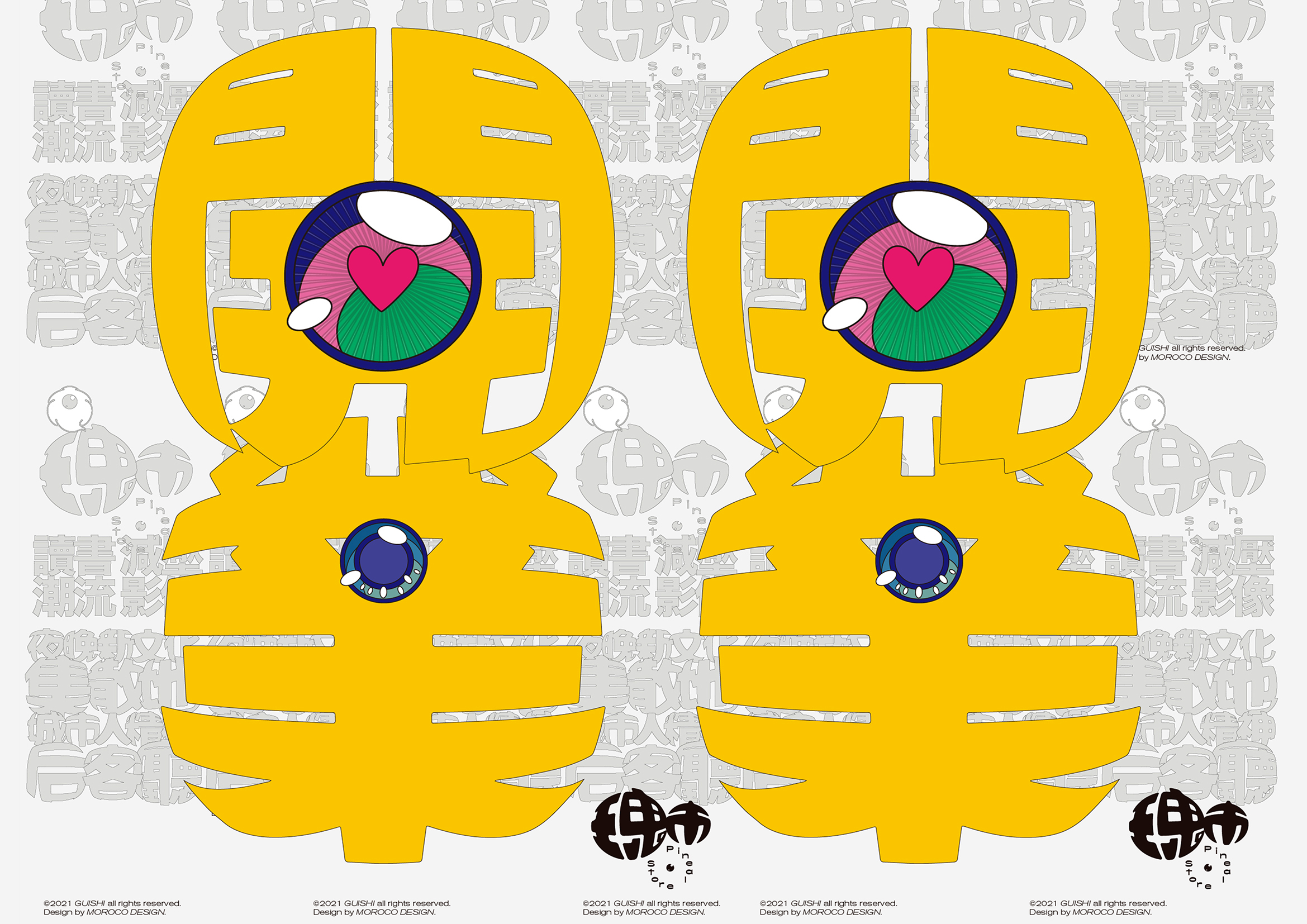
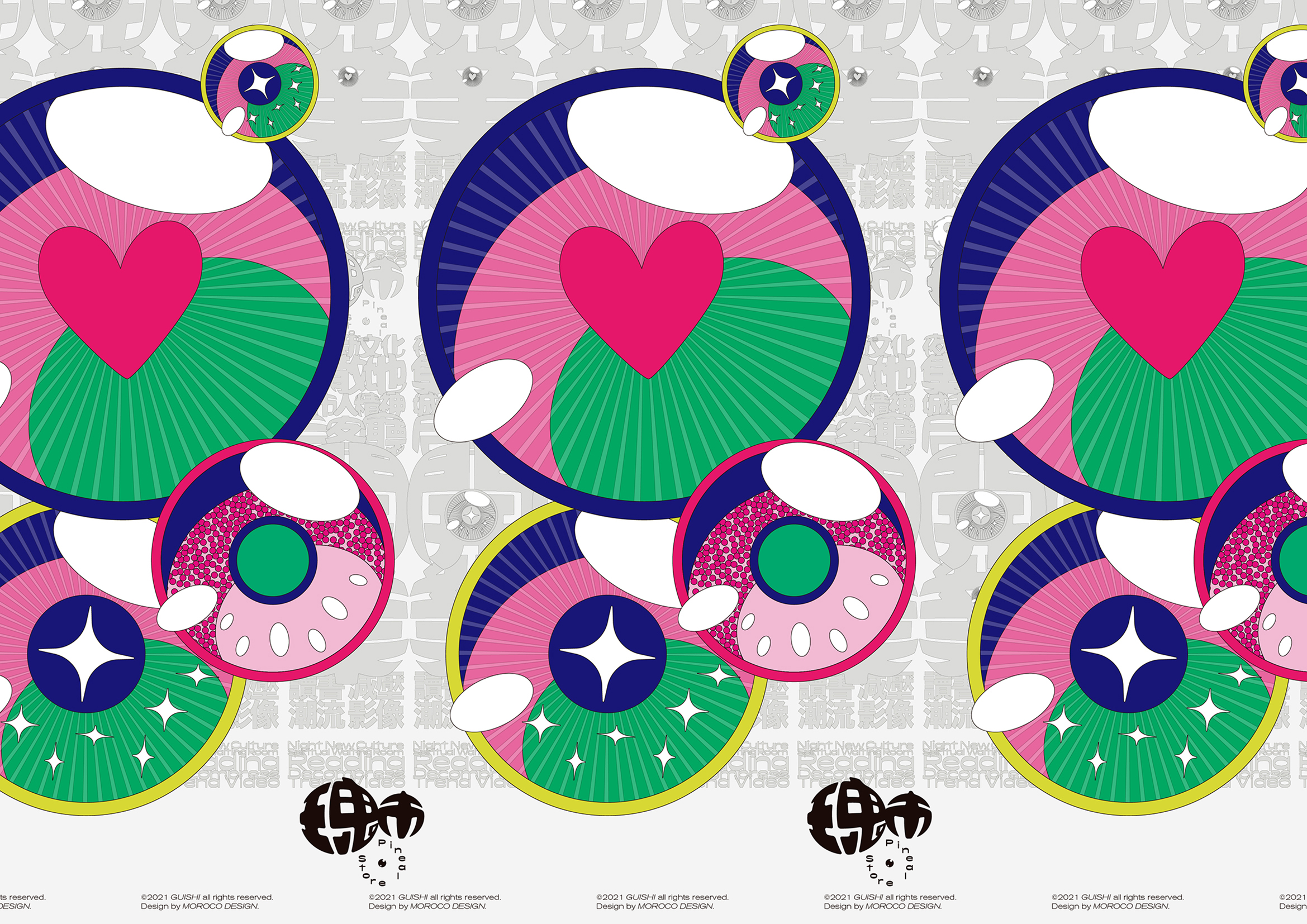
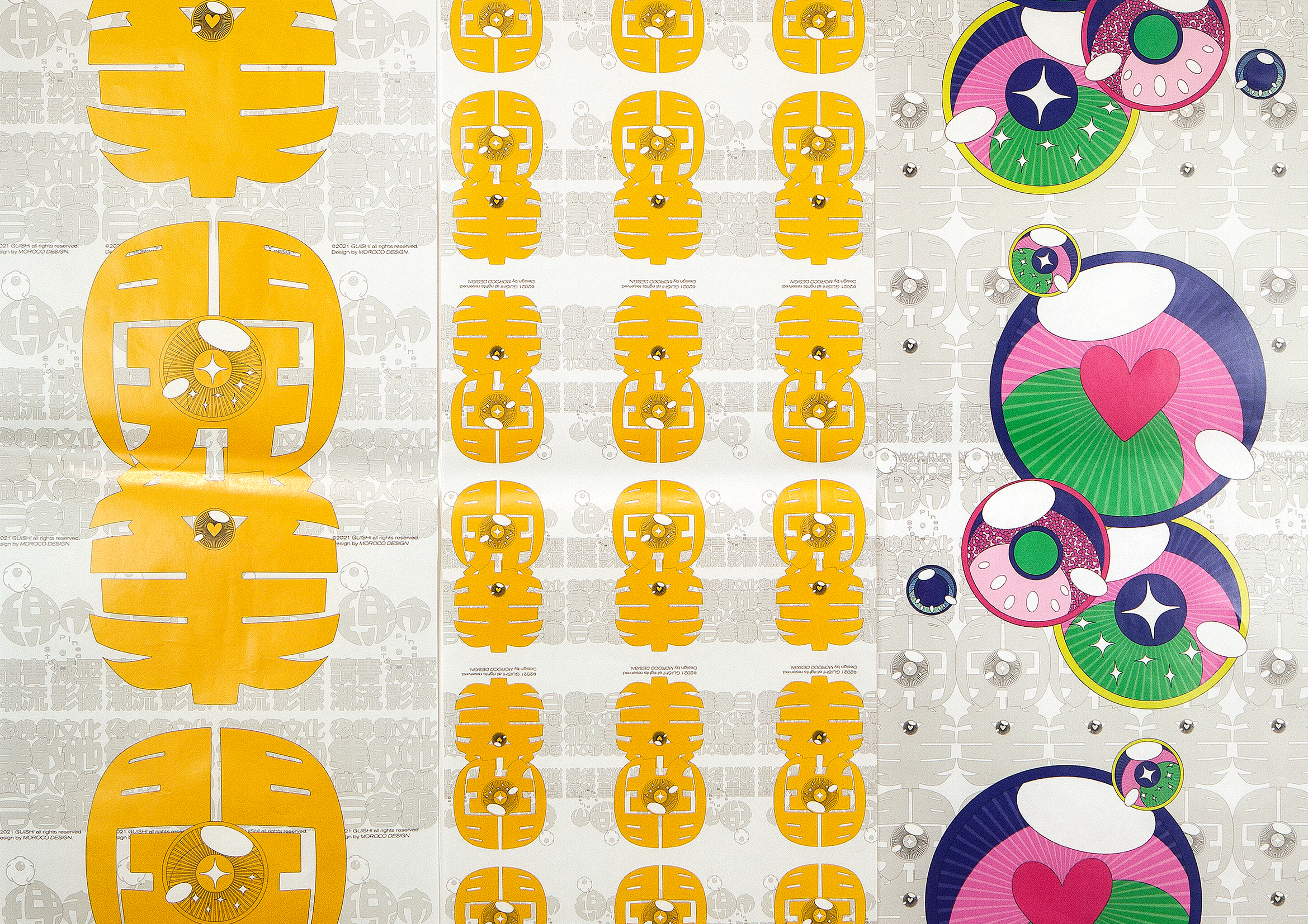
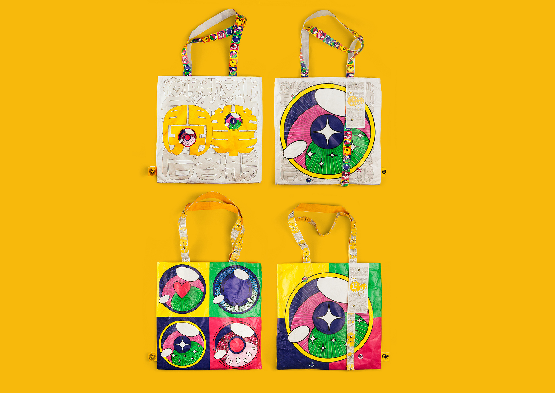
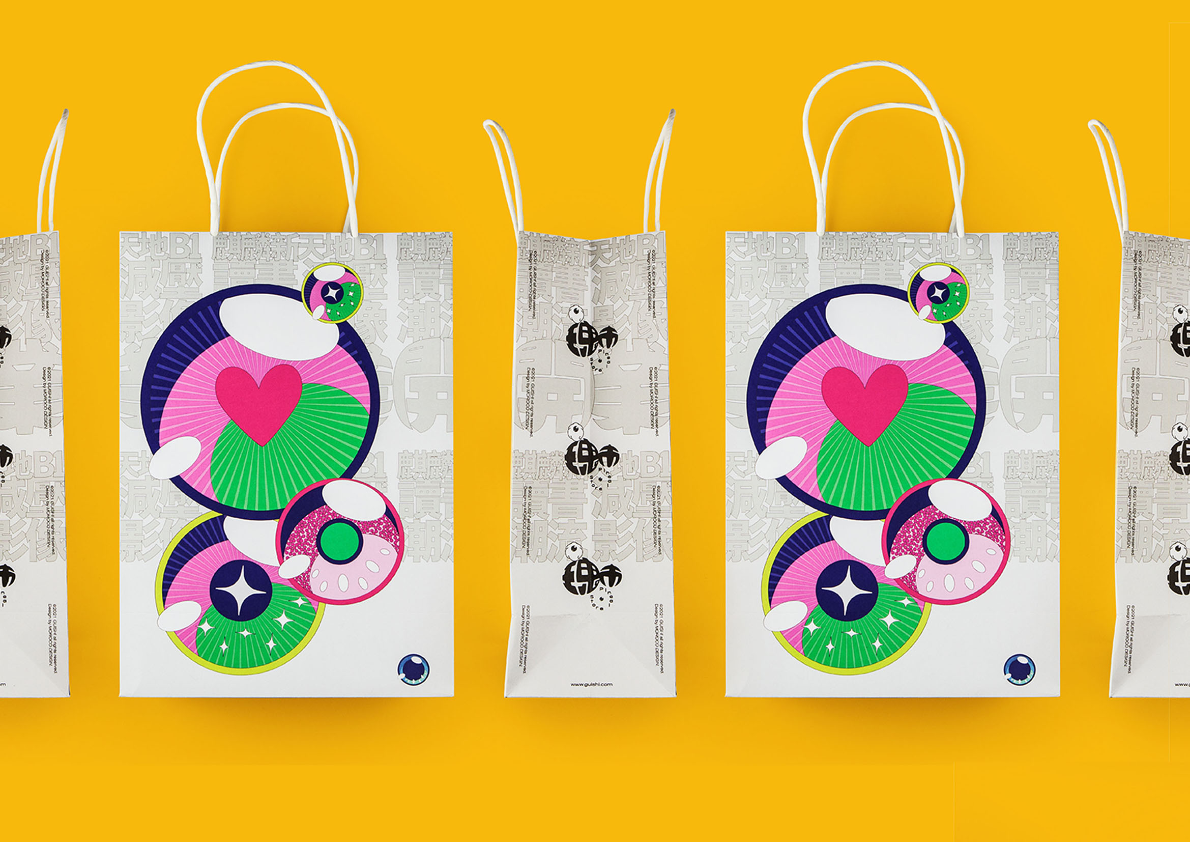
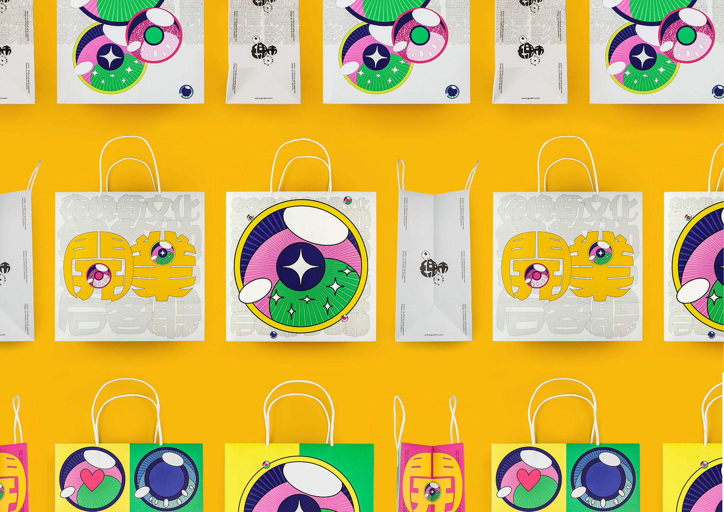
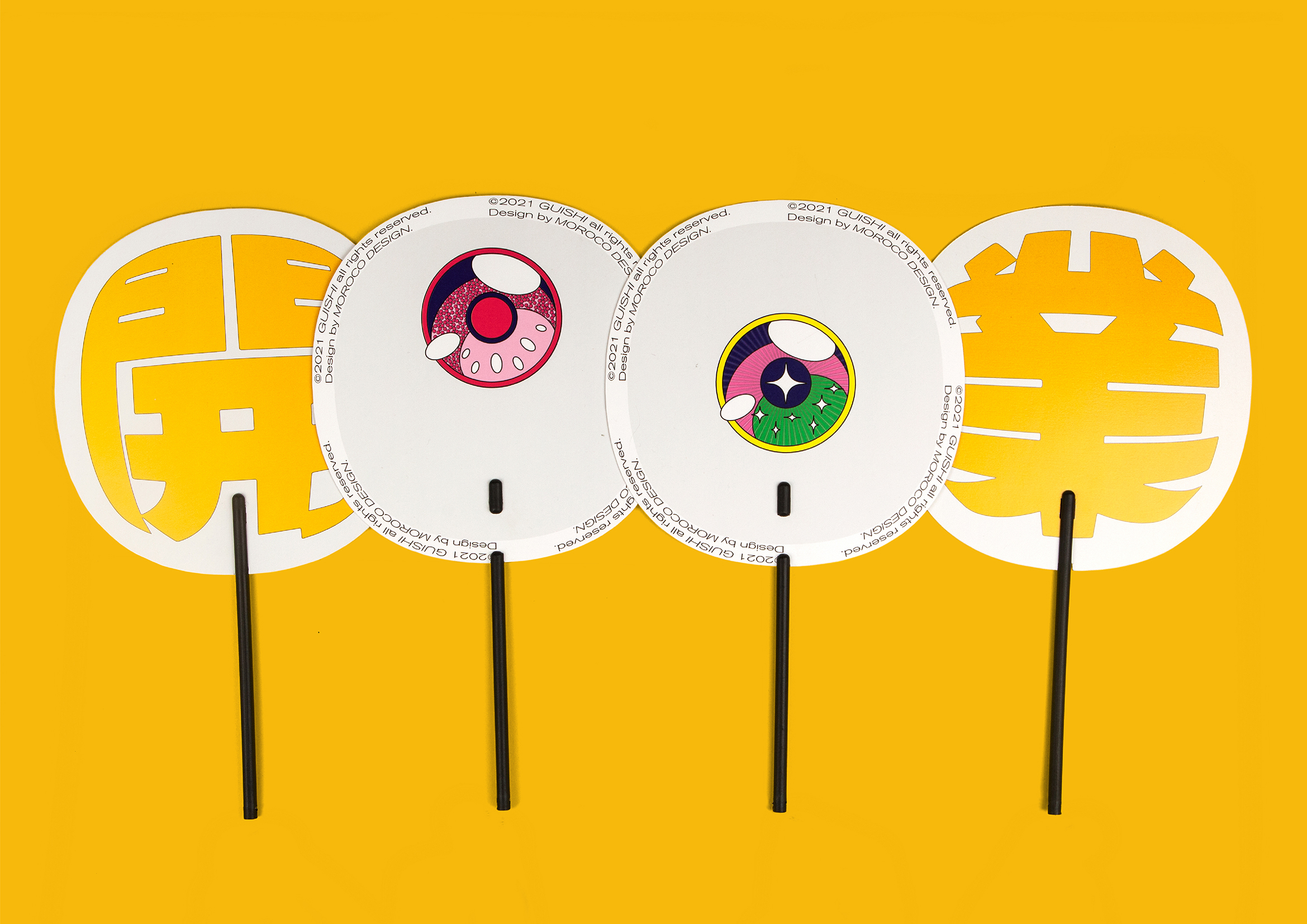
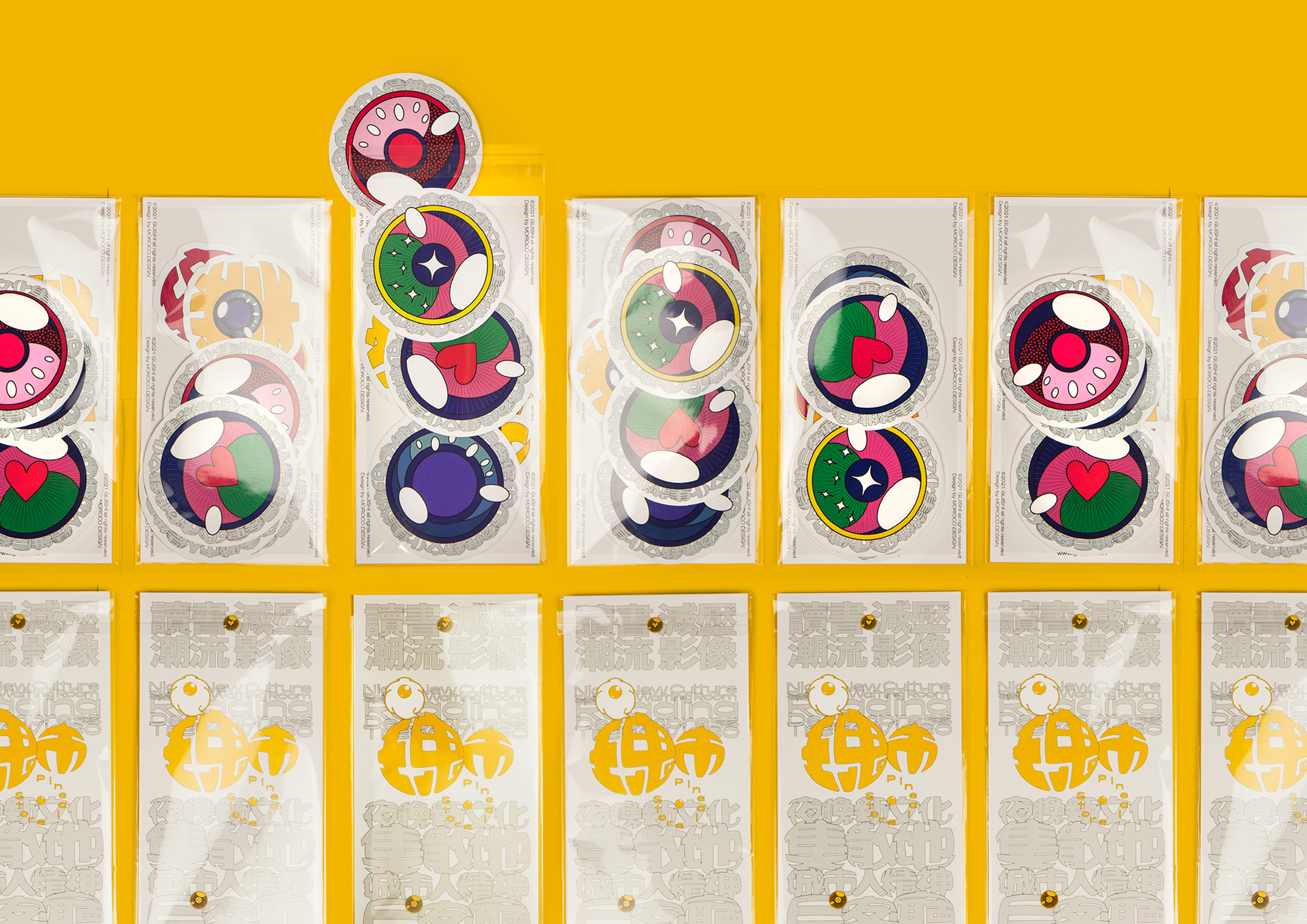
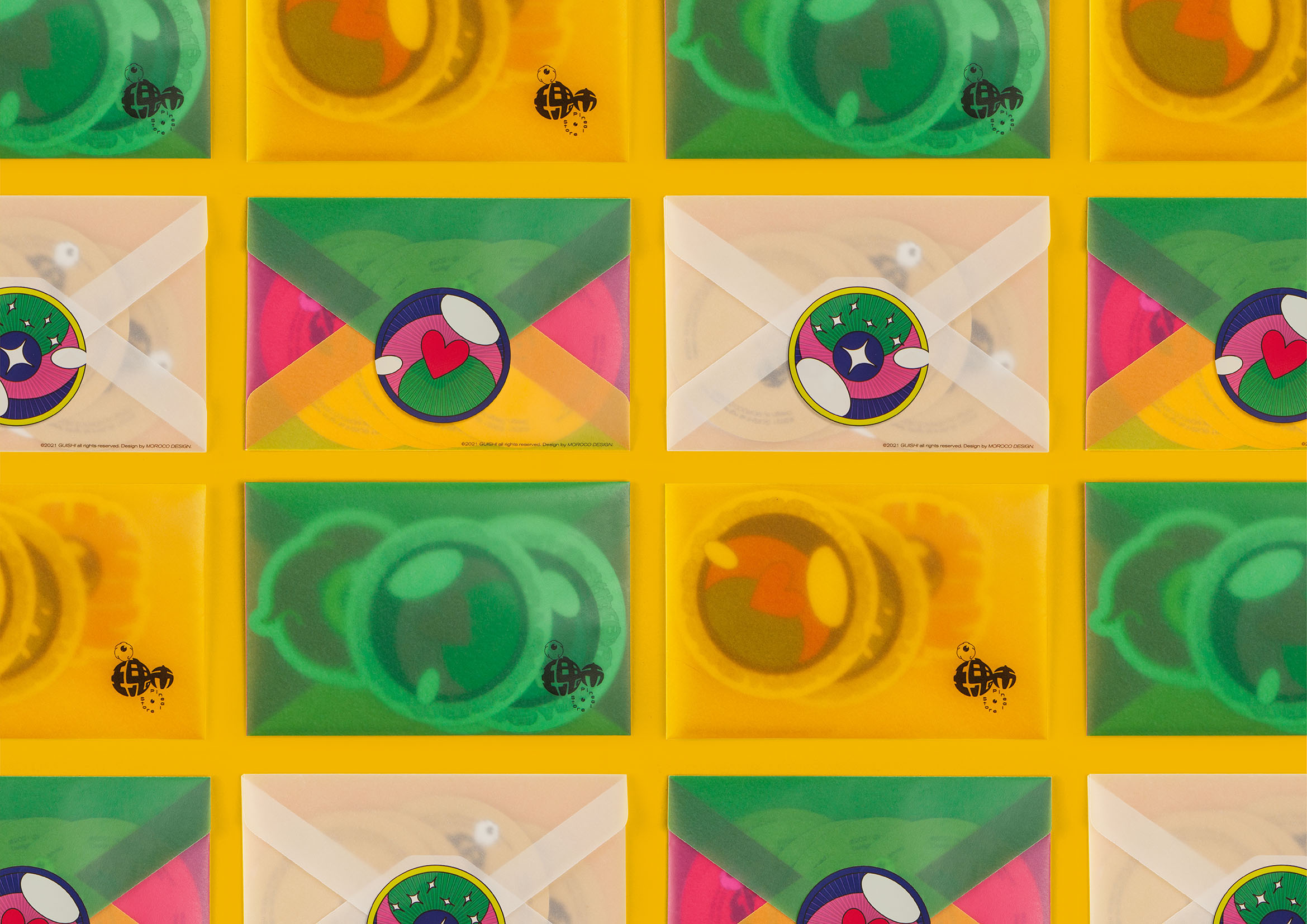
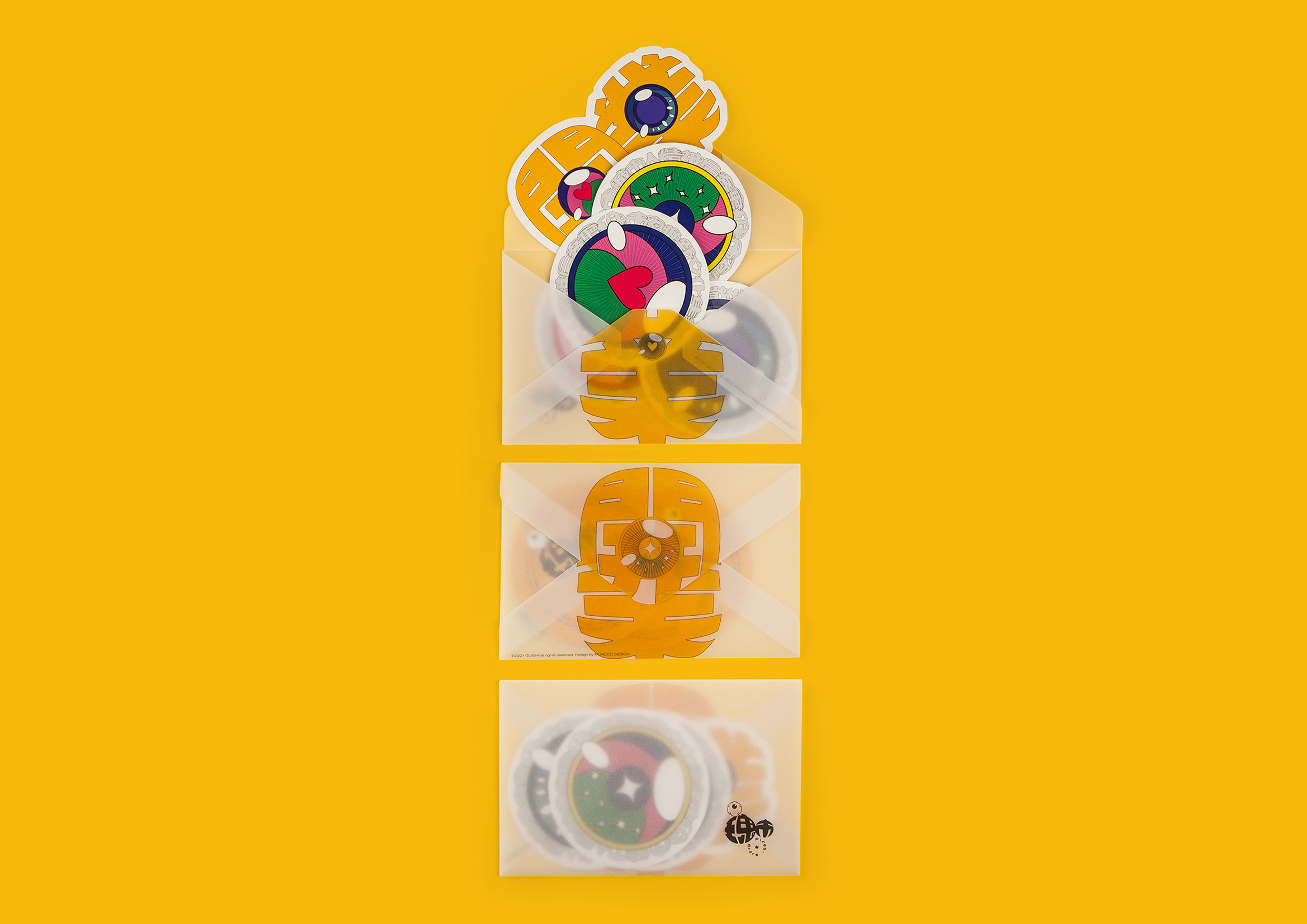
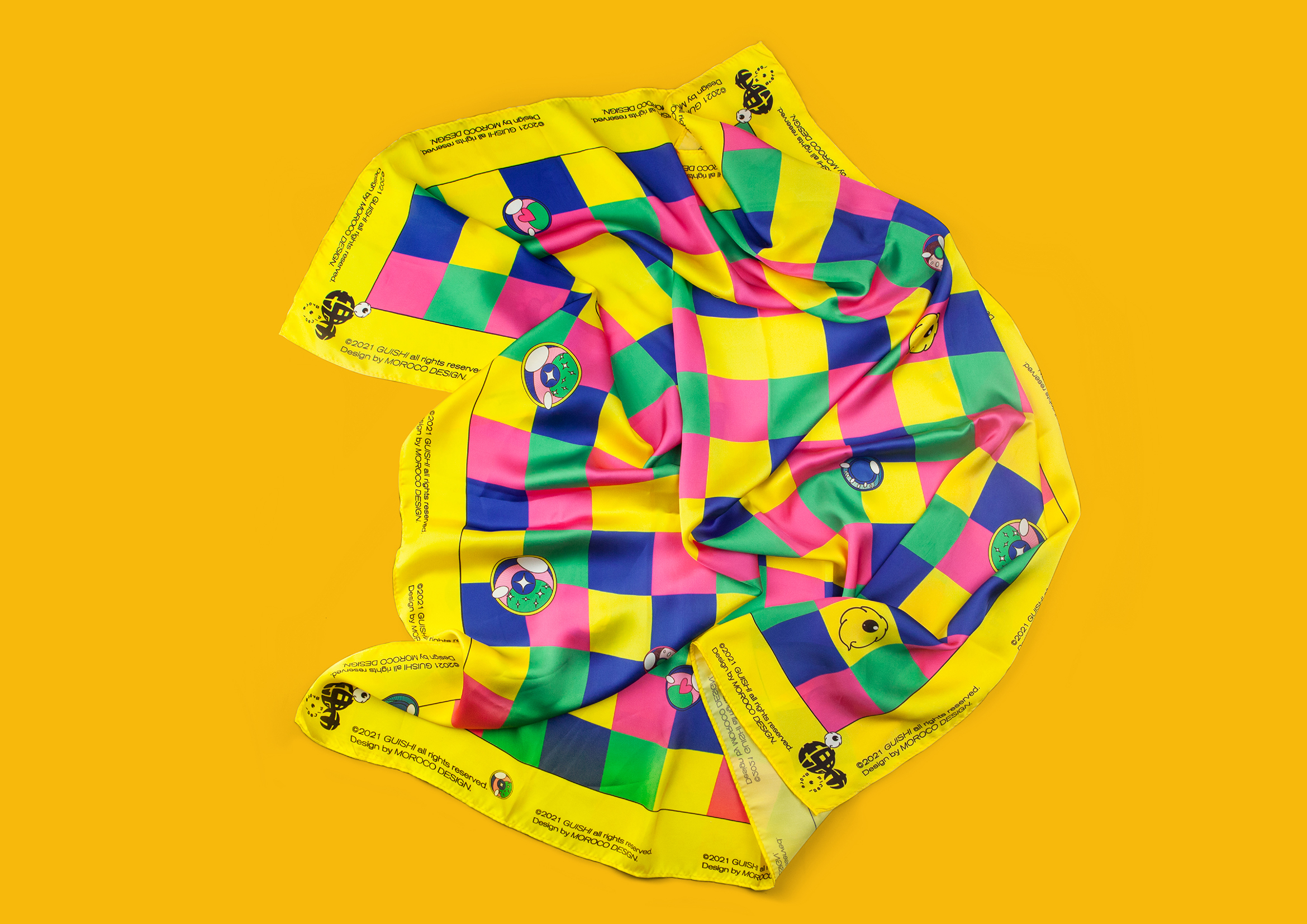
瑰丽的发现。“瑰市”拥有“瑰丽商品”的市集,同时与“鬼市”谐音。“淘得宝贝”、“发现意外”是逛“鬼市”的魅力,在“瑰市”也是一样的。所以在“瑰市”的开业形象上,“开业”的汉字与有着瑰丽色彩并闪光的眼睛成了主体。
瑰市品牌的标志设计采取了类似鱼眼镜头,凸起的造型风格,瑰市卖场开业活动的主形象中“闪光的眼球”也同样是球体的造型。在充斥着球体的语言环境中,我们将海报中主要的诉求信息也做了“球状膨胀”的造型。
现在,所有信息都膨胀起来了。所有信息都不安分的想要飘起来。
开业这件事,就是给人一种膨胀的感觉。让所有人一起来一次瑰丽的发现之旅吧!
It’s a marvelous discovery!
Marvel Fair is a fair event full of amazing
creative products, it’s also homophonic of “Ghost Fair”, an interesting Chinese
expression for fair event opens in the evening only, where you can find
unexpected products like treasure hunt. The fascinating thing about the Ghost
Fair is to discover and be surprised, it’s the same message that Marvel Fair
trying to say for the opening. That’s why we made the Chinese characters “开业”(means opening) and a glittering eye
the key visual.
The idea for Marvel Fair logo is “Blow Up”,
so we made the visual element bulging like fisheye lens, same as the eyeball
shape. It comes with all the other main message that morphed to a bulging
sphere.
The opening event is about to blow up, to let
everything float. Let’s start this marvelous discovery together!
