CREATIVE DIRECTOR: Zhang Yan
DESIGN DIRECTOR: Yang Yan
DESIGNER: Yang Yan / Wang HongWei
BRAND STRATEGY: Zhang Yan
CLIENT: GOLDEN WINGS / Kappa
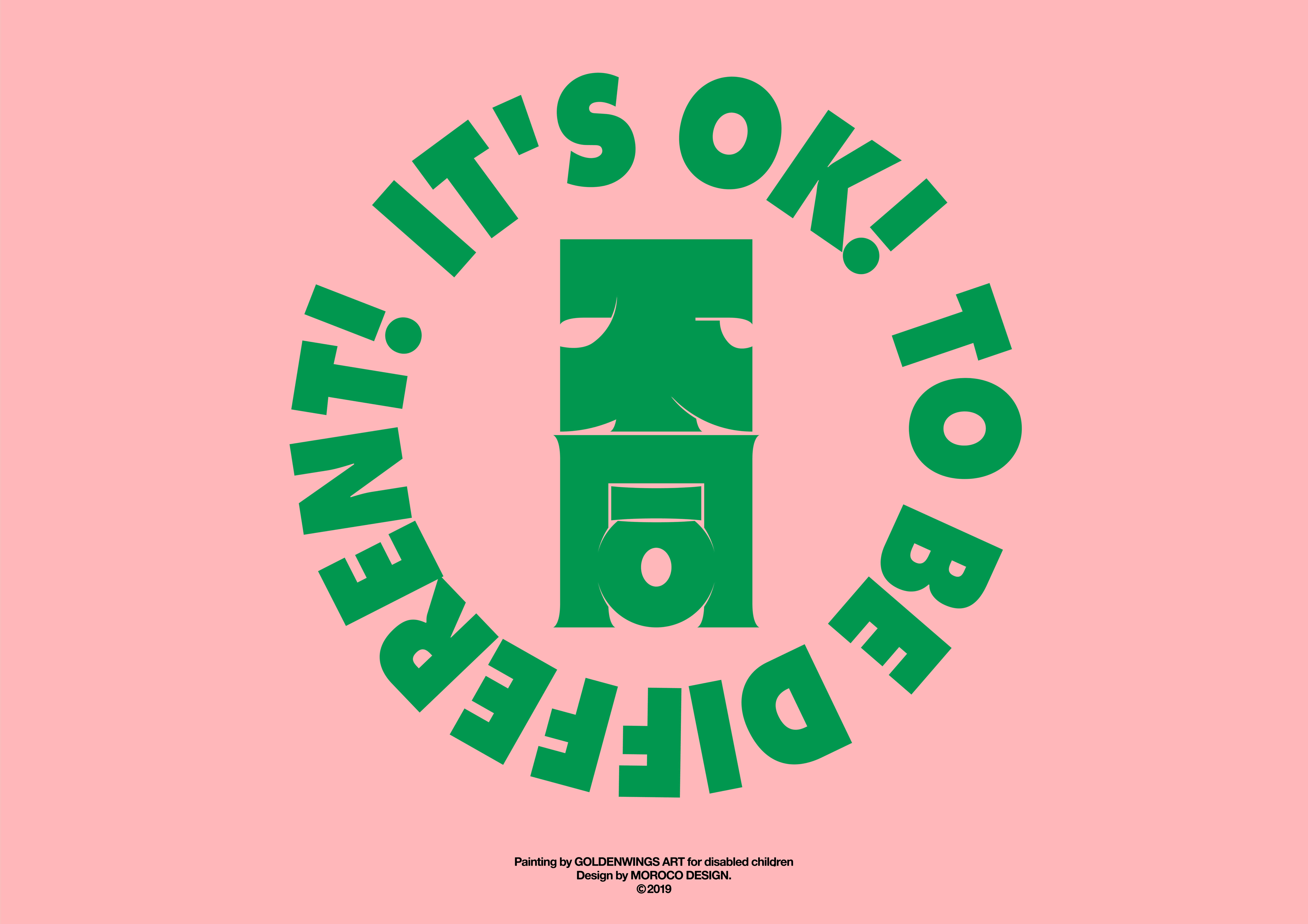
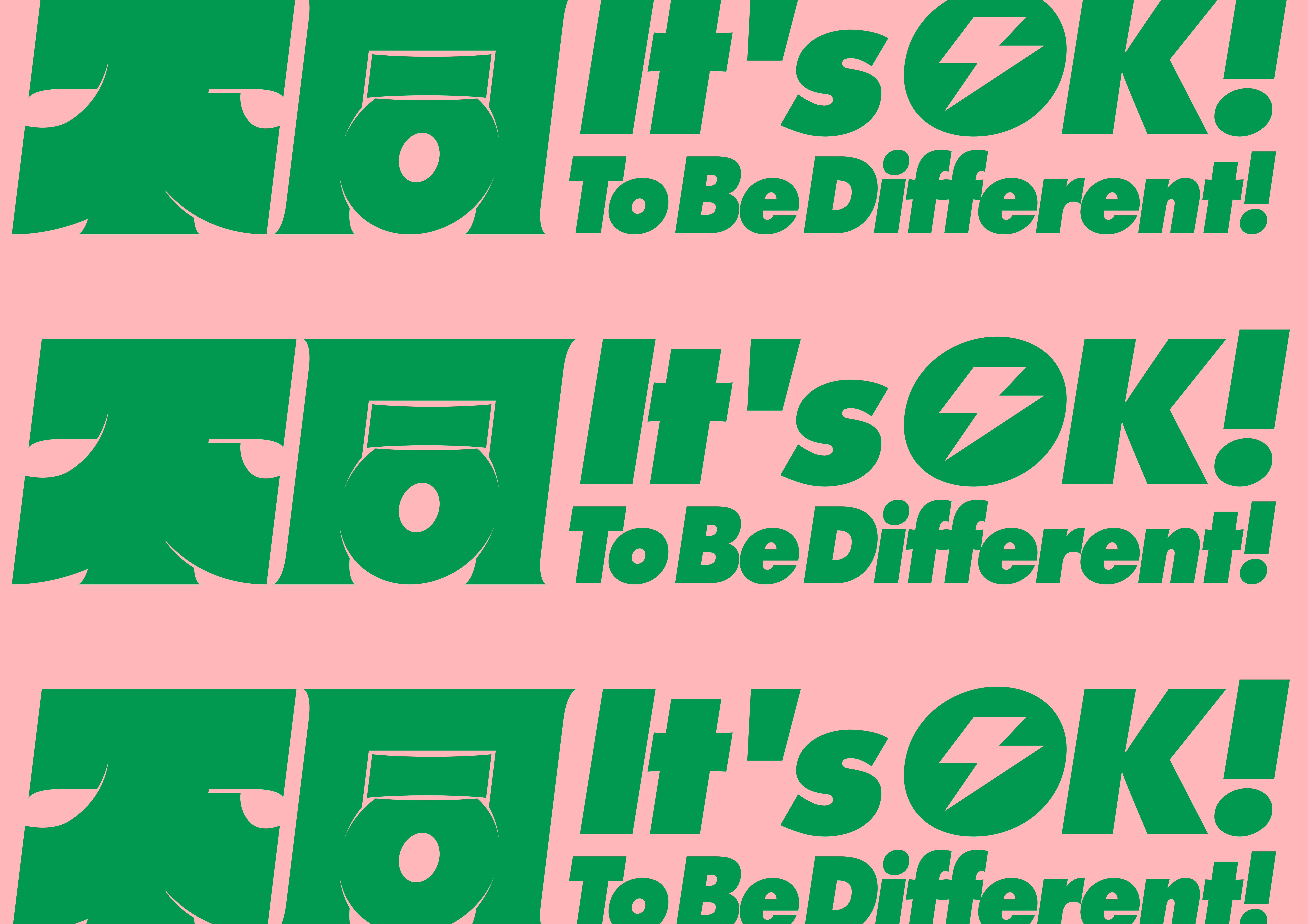
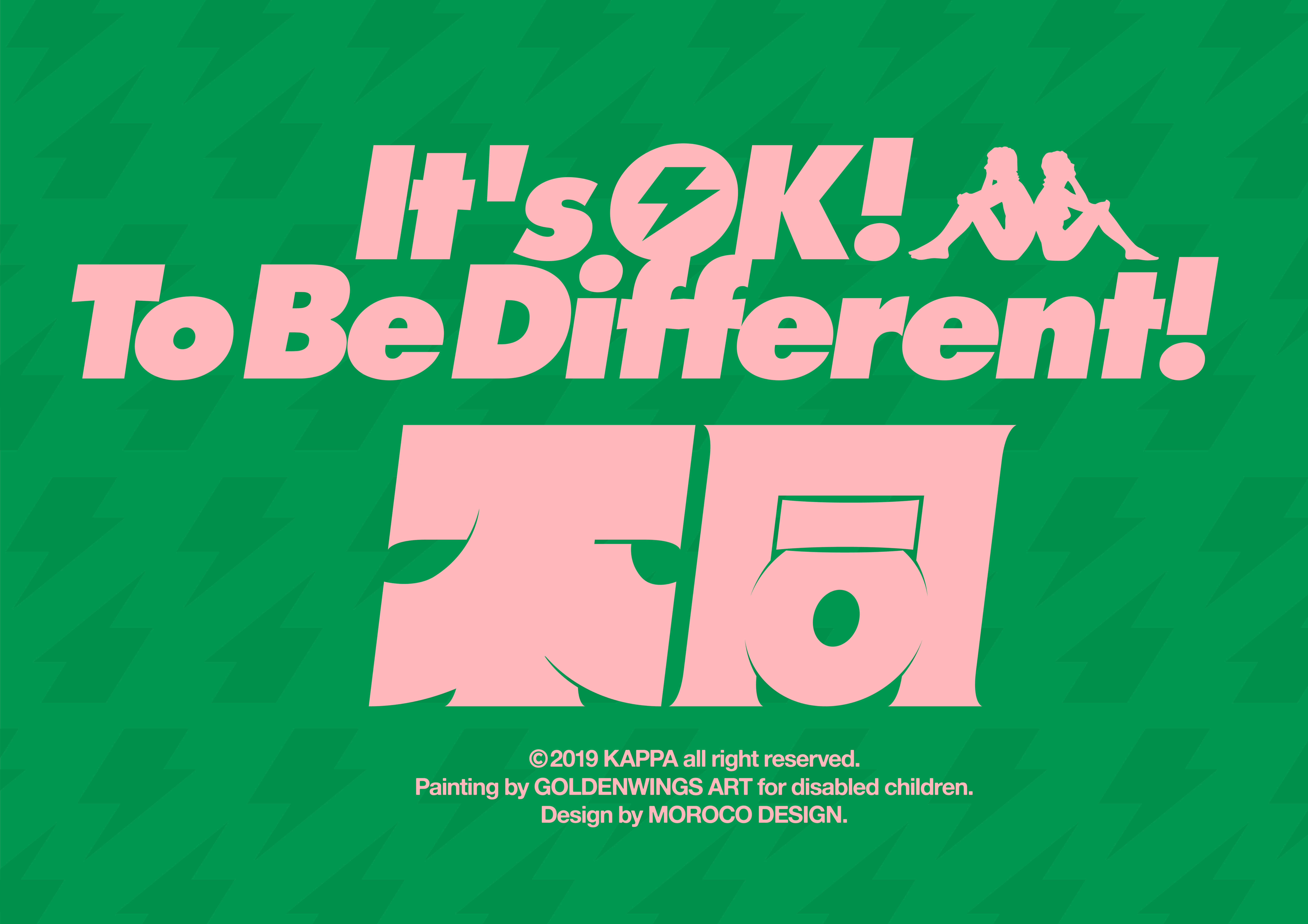
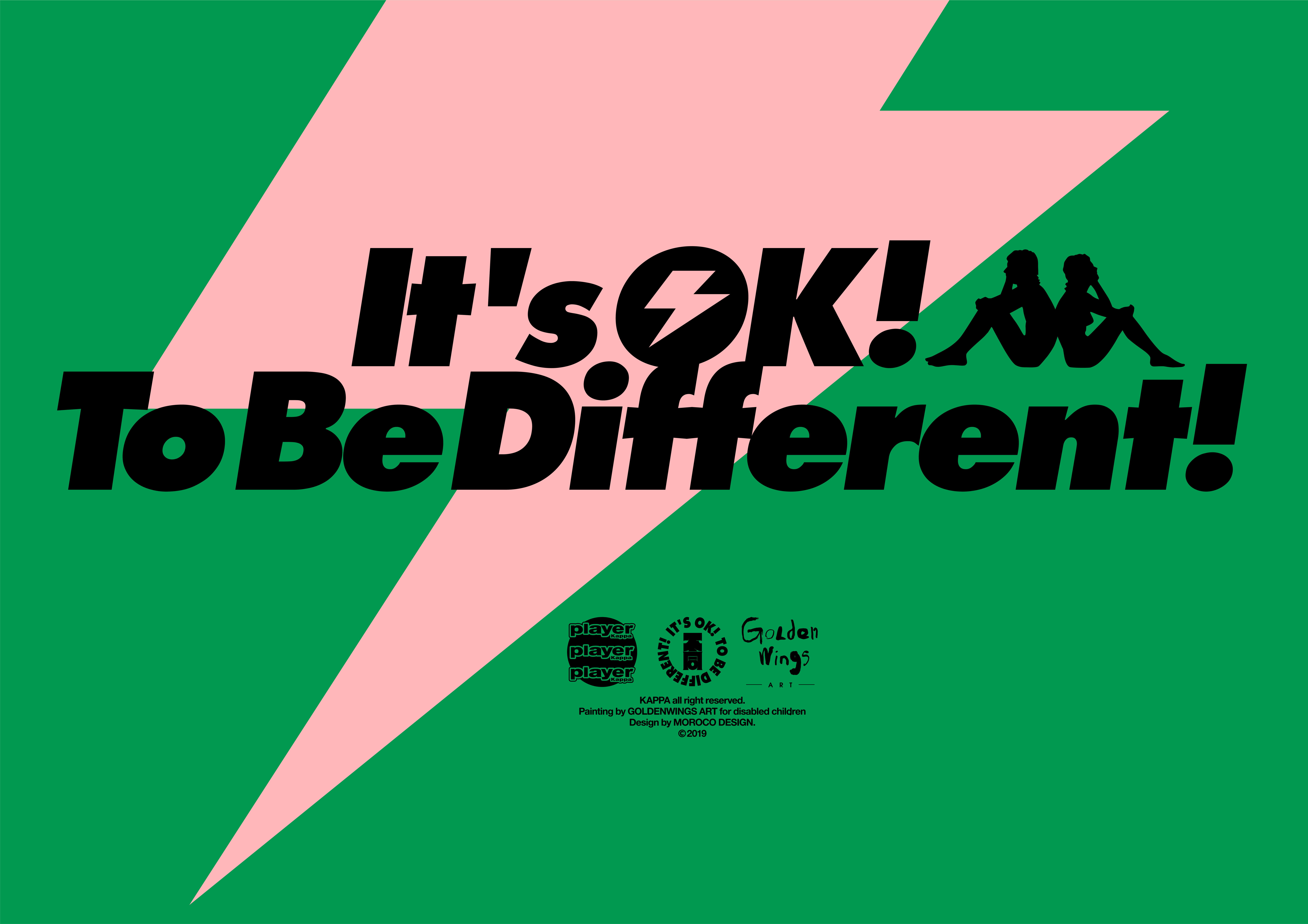
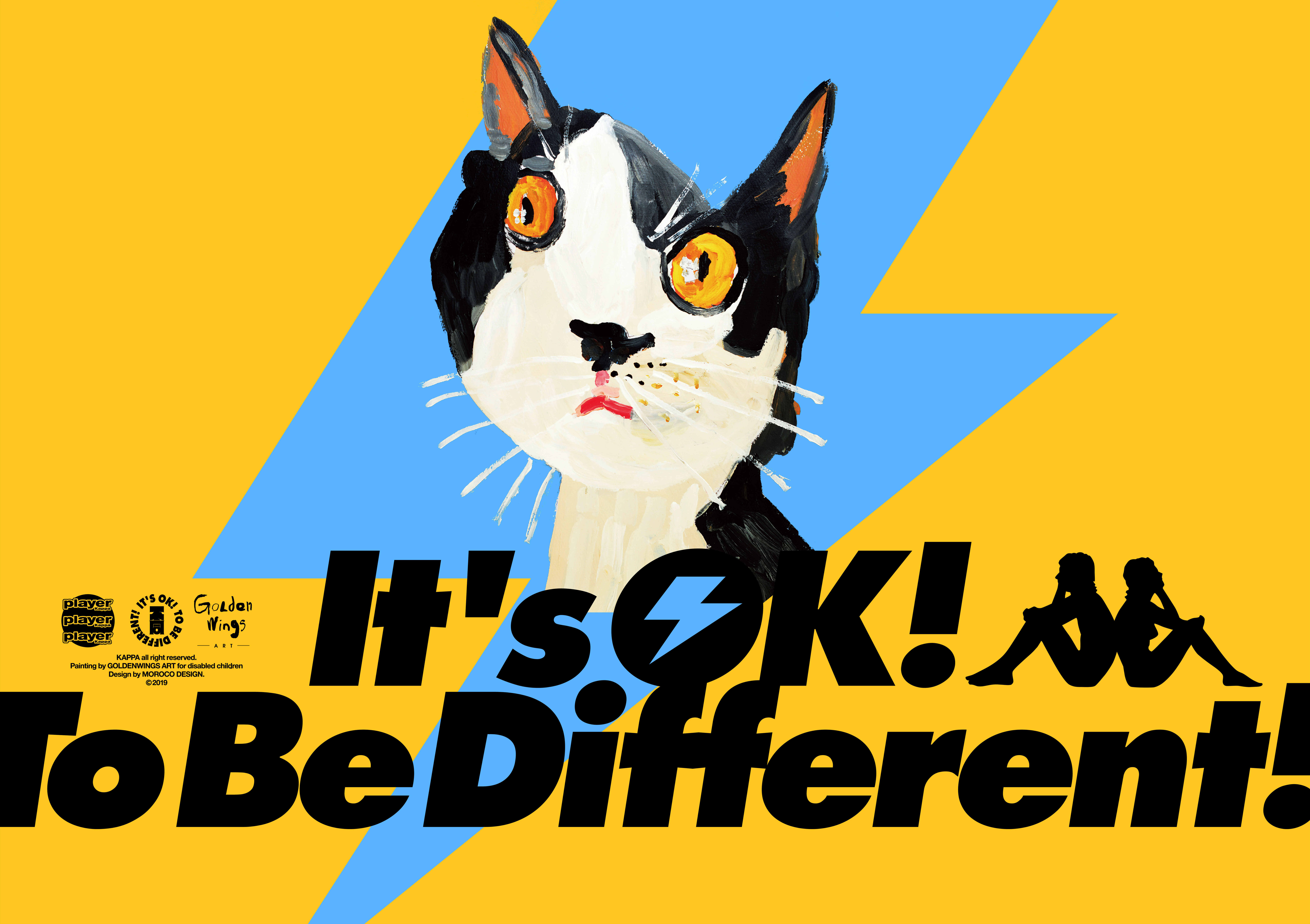
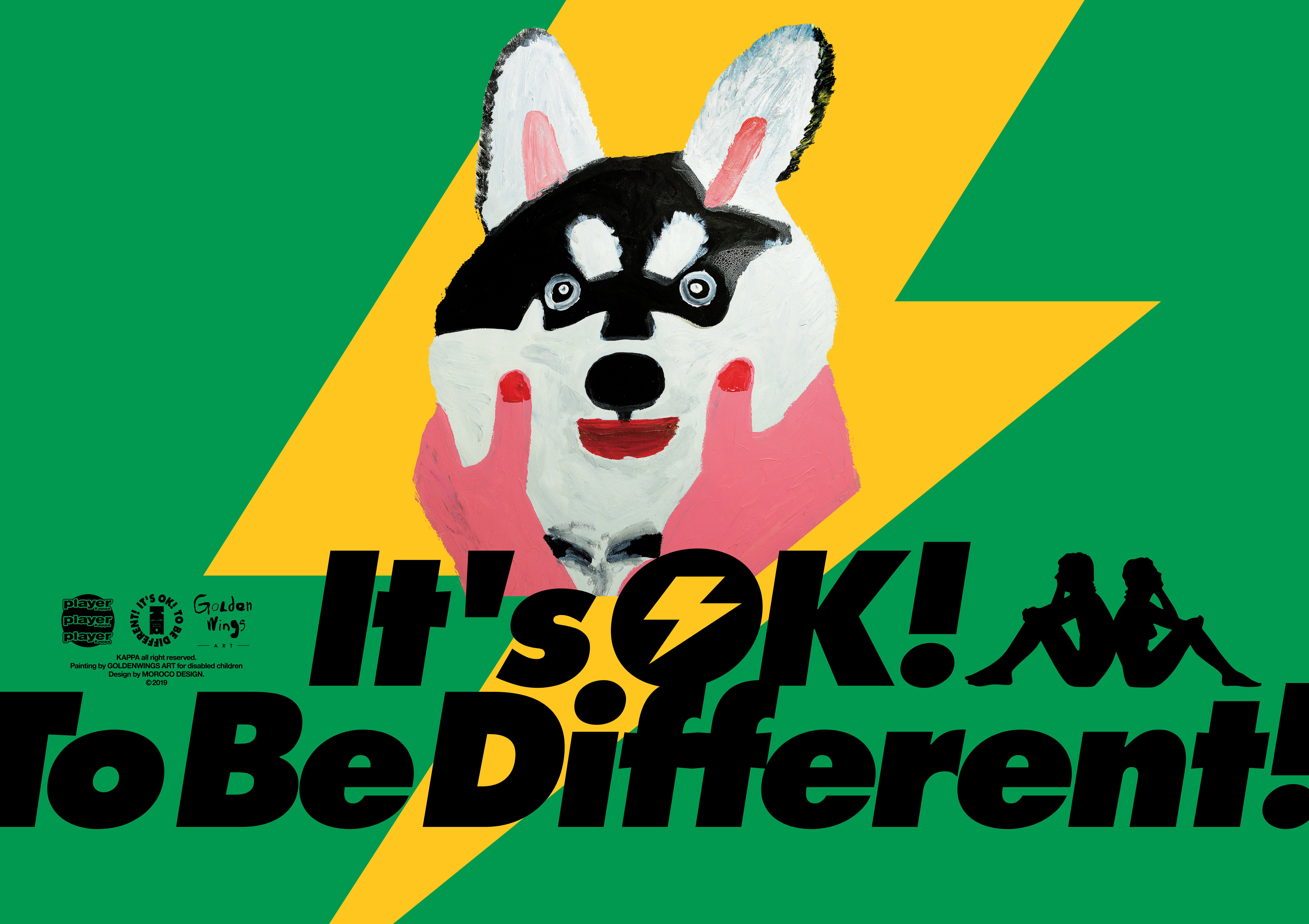
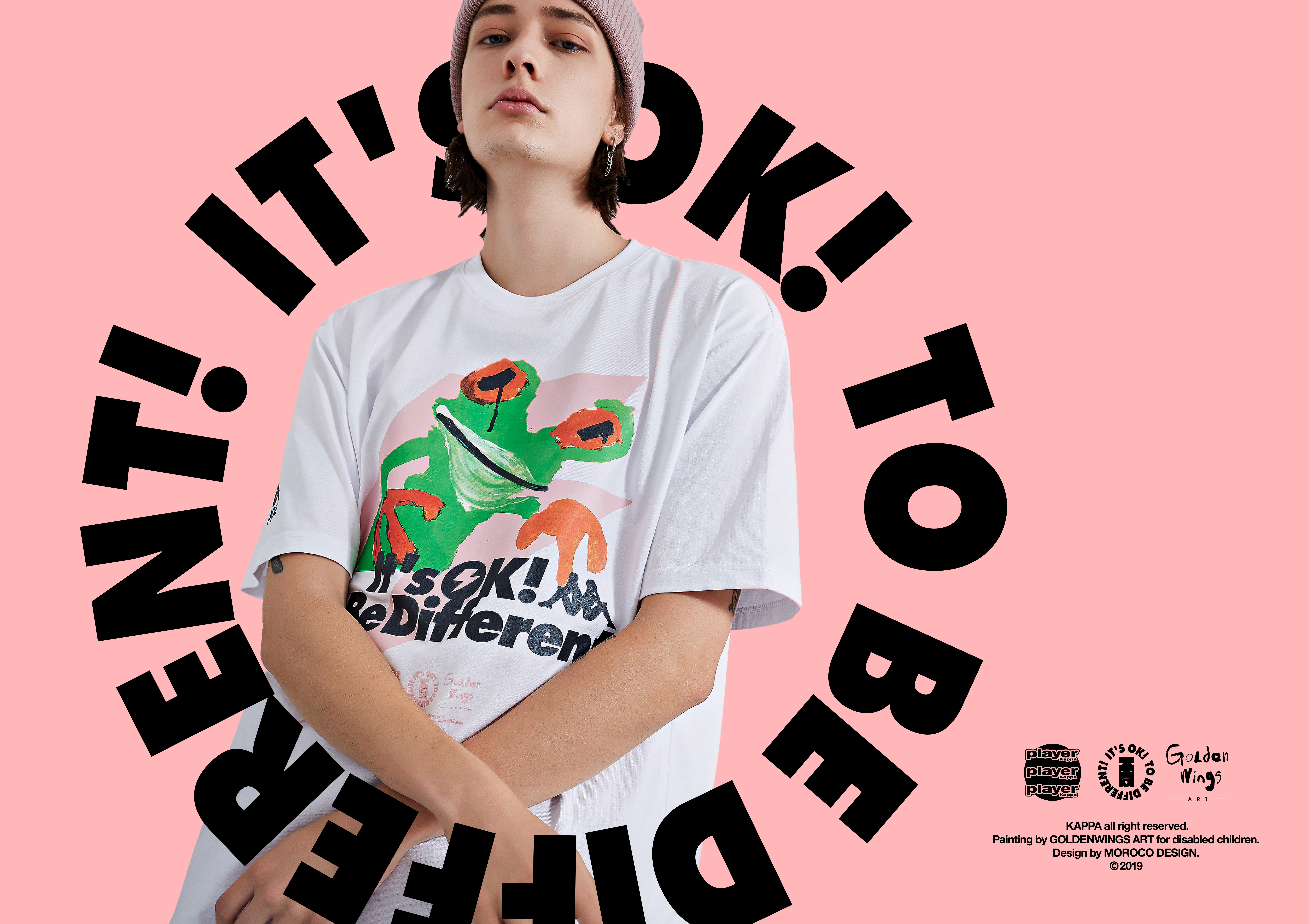
“It’s OK,To Be Different”,“不同”残障儿童商品联名公益项目品牌形象设计
这是一个助力残障青年间接就业的社会化公益项目。由MOROCO
Design、金羽翼残障儿童康复中心、Kappa共同发起。
品牌的主旨在于“正是每个人生来不同,生来具备各自不同的价值,才能在社会协作中‘用价值交换价值’”。
乐观地面对困难,自信地面对生活是品牌的主张。
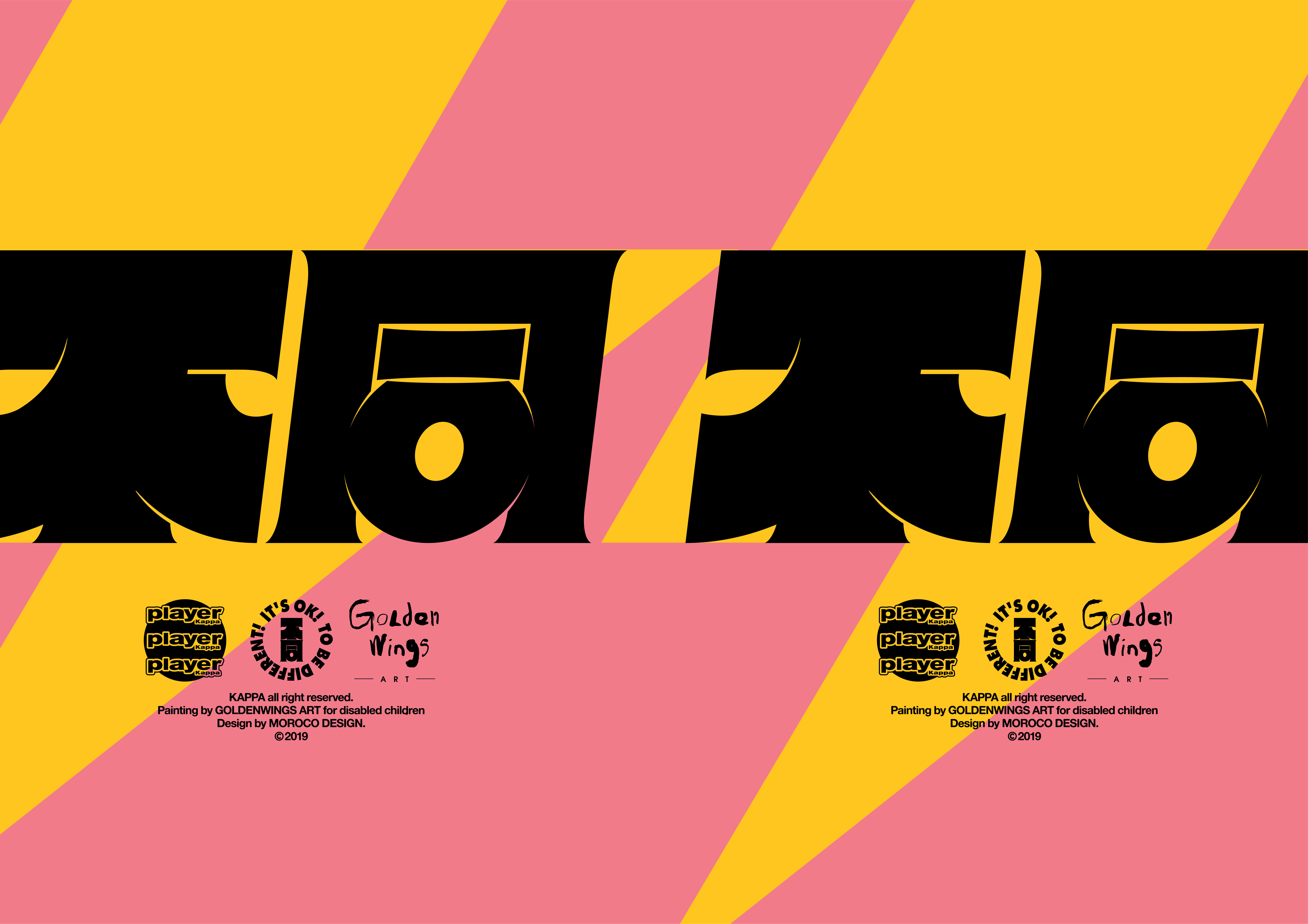
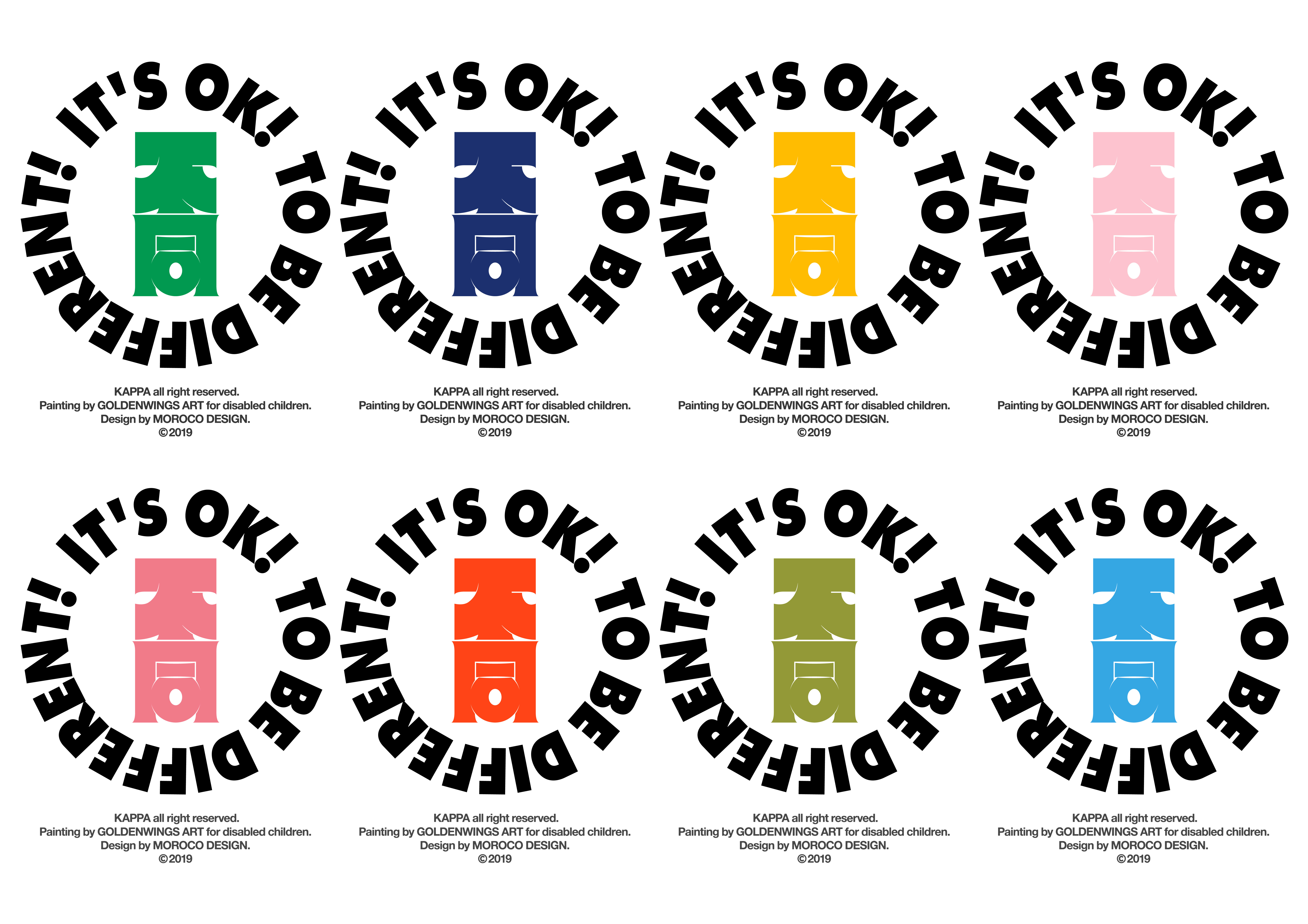
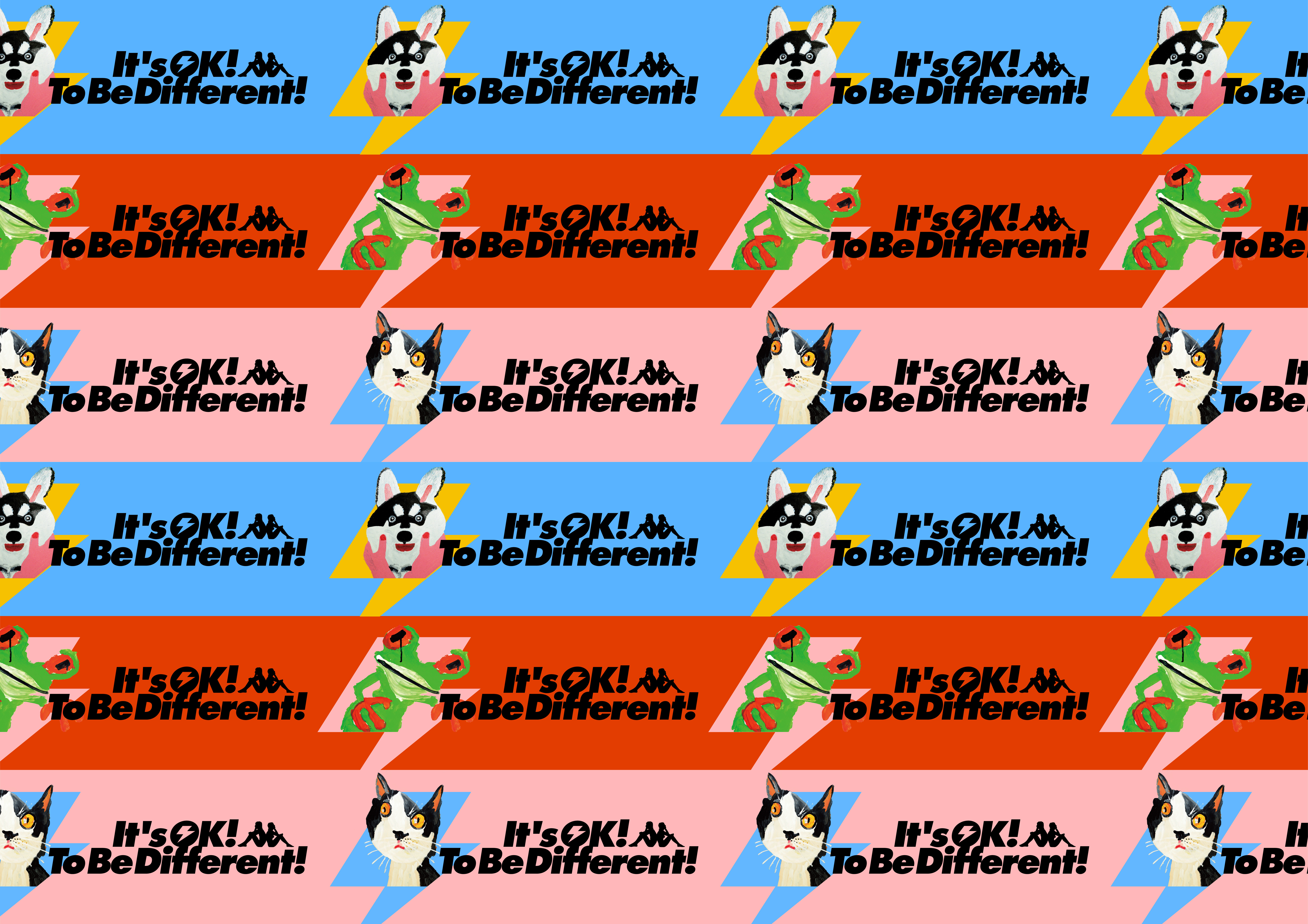
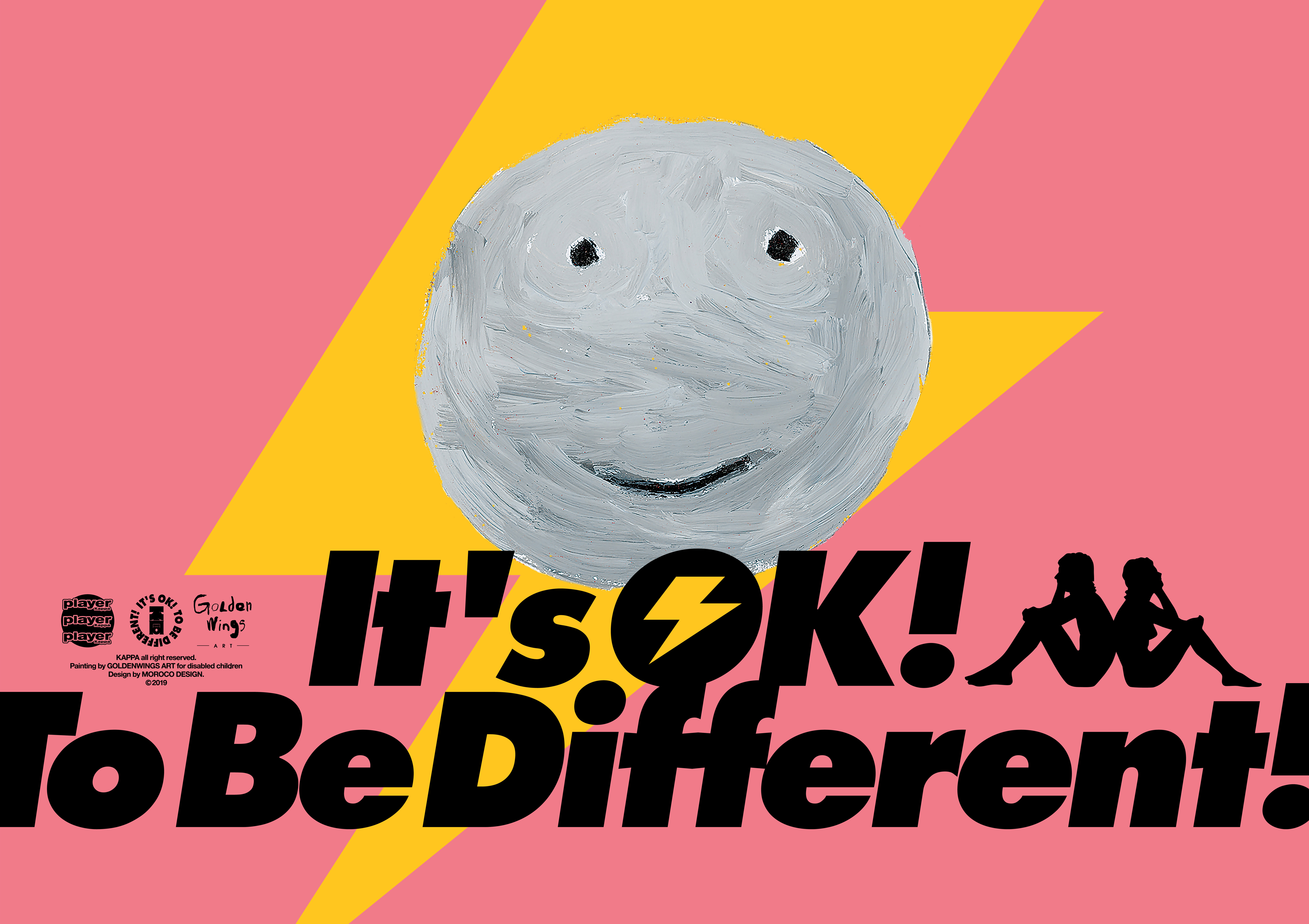
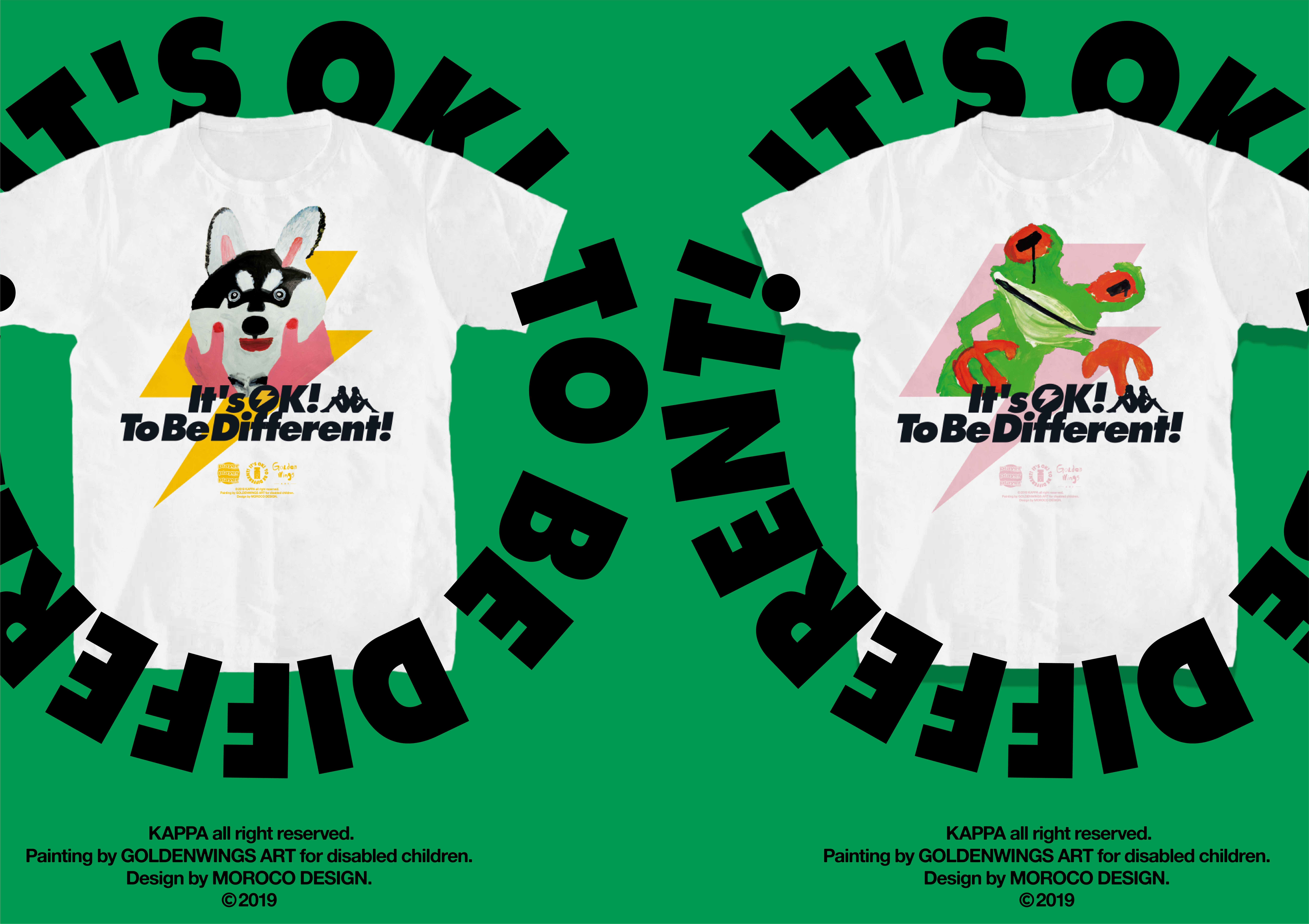
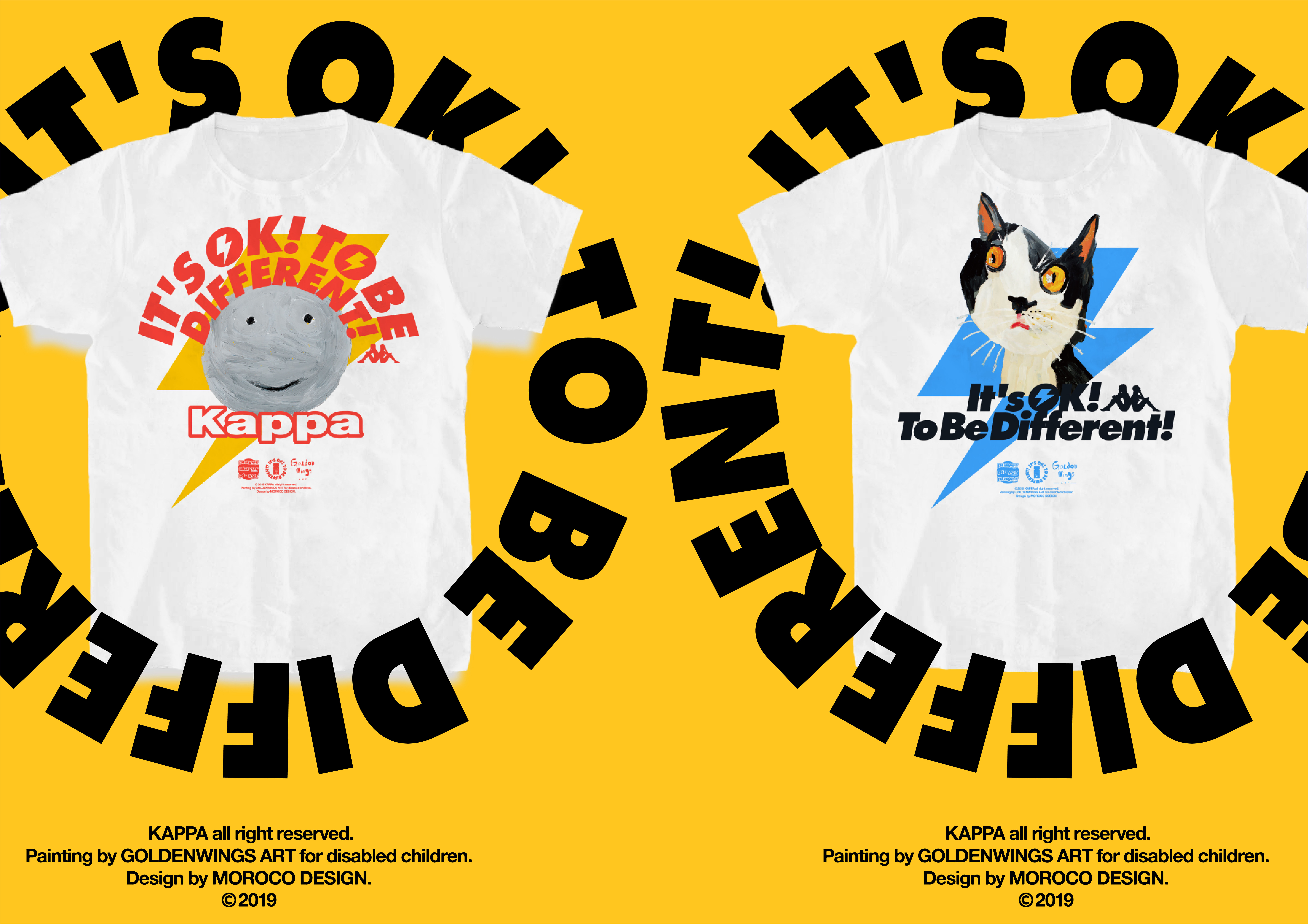
品牌的色彩鲜艳并冲撞,字体坚定而有趣味。乐观、自信、坚定、有趣与Kappa的叛逆、激情、张扬互相补充。塑造了一个新世代、新类型化年轻人的形象,把画体变成值得购买的产品,进而让一件产品真正地成为“商品”,通过商业的行为让残障青年真正“自食其力”。为“就业”、“改善生活”真正提供一份助力。
“It’s OK,To Be Different” ,”Different” brand image design of joint public welfare project of goods for
disabled children
This is a social welfare project to help disabled
youth find jobs indirectly , which is Co-sponsored by MOROCO Design , Beijing
golden wings Art rehabilitation center for disabled children , and Kappa.
The theme of the brand lies in "Everyone is
born different and born with his or her own value ,that make us ‘exchange value for value’ in social cooperation".
Facing difficulties optimistically , facing life
confidently is the brand's proposition.
The color of brand should be bright and collision,
and the font of brand should be firm and interesting.
‘Optimistic, confident, determined ,
fun’ and ‘Kappa's rebellion,
passion and publicity’ complement each other. Shaping
the image of young people of new generation and new type, turn the artwork into
product worth buying , then make a product truly a commodity , disabled youth
can really ‘earn their own living’ through commercial activities. Provide a real boost to employment
and improve their life.
